WRITING
I Drew a Map of My Own AI Setup — The TL Harness Manual
I'd accumulated over eight hundred parts for my AI assistant, and I couldn't tell you which ones were still turning.
This is the manual for TL Harness, and also the story of building it. It's a small Mac app: open it and it scans my whole AI assistant setup, then draws it.
A check that had been silently dead for two days
Let me start with the thing that made me build it.
I was cleaning up "hooks nobody had wired in" — a hook being a small check that runs automatically before or after each conversation. I had an inventory listing which hooks were wired into the master switch and which weren't. Going by that list, I deleted one that looked unwanted.
Two days later I found out it wasn't unwanted. It was wired in indirectly, through another index rather than the master switch, so my inventory had counted it as an orphan. For those two days, a check I believed was running had not run once — and it said nothing.
The problem wasn't carelessness. The inventory simply can't answer that question. It can tell you "there are 36 hooks." It cannot tell you "what breaks if I delete this one." That second question is about relationships, and relationships don't live in the inventory — they live inside the body text of each file: who calls whom, who invokes which rule.
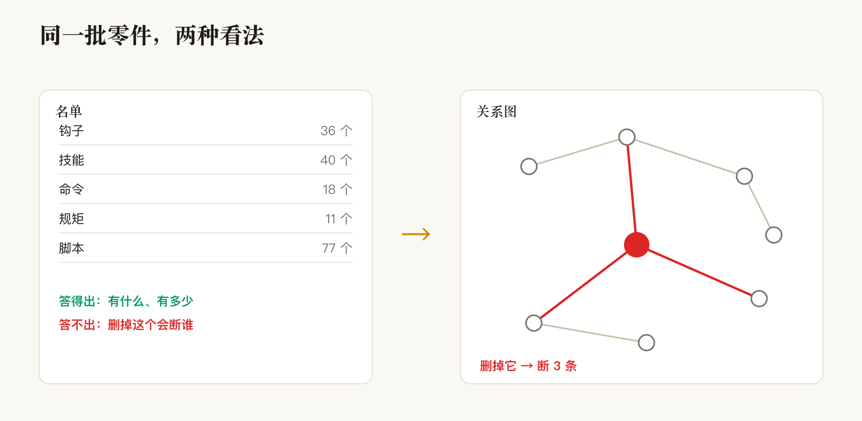
So I wrote this program. What it does fits in one sentence: pull every reference scattered across the body text of a few hundred files, and connect them into a graph.
No cache, no intermediate files. Every launch is a fresh scan of disk, so what you see is the truth right now. Add a skill, edit a hook, write a new note — press rescan and it's current.
Two networks, deliberately not merged into one
What comes out of the scan splits naturally into two piles, and I draw them as two unrelated graphs.
| What it draws | The question it answers | Current size | |
|---|---|---|---|
| Tool network | Rules / hooks / commands / skills / scripts — eight kinds of part — and the calls between them | How my tools hang together | 228 nodes, 306 lines |
| Experience network | Every note I've written, and the cross-references between them | How my experience hangs together | 677 notes, 913 links |
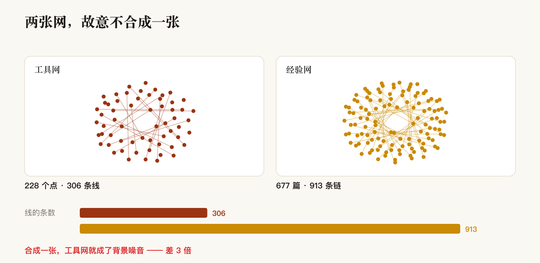
I did originally want one merged graph; it would have looked more impressive. Then I drew it and saw that nine hundred-odd note links completely bury three hundred tool lines. You go in wanting to see "what does changing this command affect," and your eyes are swamped by the note network instead.
Lines that cross between the two graphs — a rule whose text names a specific note, say — aren't lost. The radial layout just skips them when it can't find a landing point. Click any node and both directions show up in the detail panel.
Three views, three kinds of question
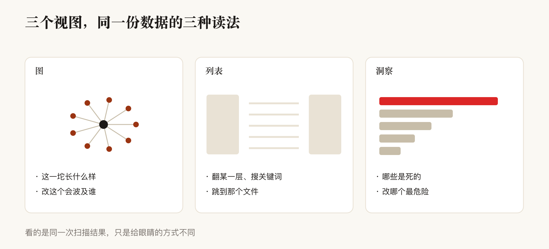
These three are what you get on launch, switched from the top bar. They look at the same scan; they only differ in how they hand it to your eyes.
| View | When to use it | What it gives you |
|---|---|---|
| Graph | "What does this mass actually look like?" "What does changing this affect?" | Nodes and lines. Hover for a name, click for detail, and once selected you can narrow to "just one hop around it" and re-lay-out |
| List | "Page through one layer" "search a keyword" "jump to that file" | Three columns: entry points on the left, every item plus search in the middle, detail on the right with clickable "references / referenced by" |
| Insight | "Which things are dead?" "Which one is riskiest to change?" | Five sections of conclusions: connectivity, hub ranking, broken links, name collisions, orphan ranking |
The graph has three modes: mind map (radiating from a center — what do I have, which layers are fat, which are thin), knowledge network (the same nodes with dependency lines, showing what cross-layer coupling looks like), and experience network (notes grouped into sectors by where they live).
The three modes measure different things, so switching leaves a permanent line of text above the graph explaining what this particular graph draws and what node size and color mean here. In the first two, a bigger node means it eats more of your budget in every conversation. In the third, a bigger node means it has more links.
One trap I fell into is worth putting in the manual: don't let the interface economize on your words.
I originally put a toggle in the window's top bar. The Mac top bar eats a toggle's text label outright, leaving a bare naked square. Pressing that square takes the scripts in the graph from 77 to 572 and buries the whole picture — with not one word of warning on it. I moved it into the graph's own control strip with text and a count. Moving it wasn't enough: narrow the window and that strip squeezes the text to zero width, and it's a bare square again. You have to tell the interface explicitly that those characters may not be compressed.
The criterion now is simple: can a new user work it without reading the manual? If you have to come back to the docs to learn what a button does, that's a defect in the interface, not in the docs.
Orphans must be split four ways, or the number says nothing
This is the most valuable thing I got out of the whole exercise, and the app's single most useful feature.
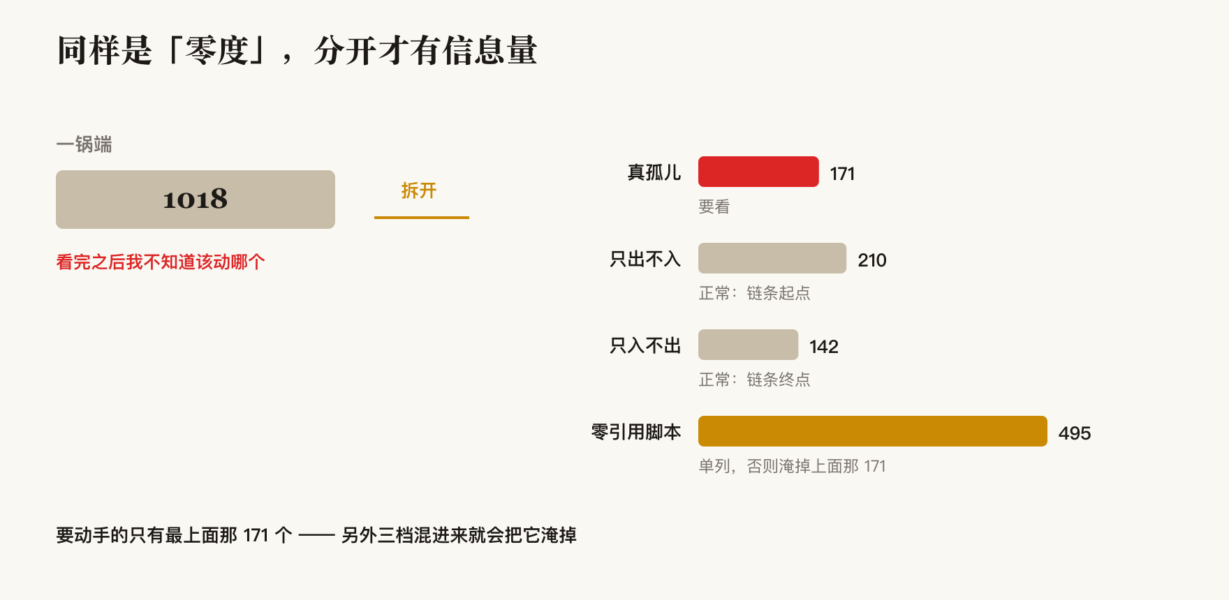
The first version told me "1018 things have zero degree," and I sat staring at that number for a while — it told me nothing. Because "nothing connects to it" has four completely different meanings, and mixed together they dilute each other.
| Tier | Definition | Measured | Do I care? |
|---|---|---|---|
| True orphan | References nothing, and nothing references it | 171 | Look at these. But dead on the graph isn't dead in life — it may still be something I type by hand or a scheduled job calls |
| Out-only | References others, nothing references it | 210 | Normal. Commands and skills are chain starts by nature |
| In-only | Referenced by others, references nothing | 142 | Normal. Scripts and notes are chain ends by nature |
| Unreferenced script | Nothing in the config directory mentions it at all | 495 | Listed separately. Mixed in, it drowns the 171 real problems above |
There's a second trap after the split: the list must not be truncated.
I first put the orphan ranking inside the insight panel, where only the top 40 fit. "There are 171 orphans" and "I can go through all 171" are two different things — a truncated ranking hides the other 131. And with alphabetical sorting, the top 40 all came from whichever layer had the earliest initial, so other layers never surfaced at all.
Now those six rosters — the four tiers above, plus broken links and name collisions — are each their own entry point in the sidebar: complete, searchable, clickable, with jump-to-detail.
What it caught
First: 263 filenames existed in two spellings.
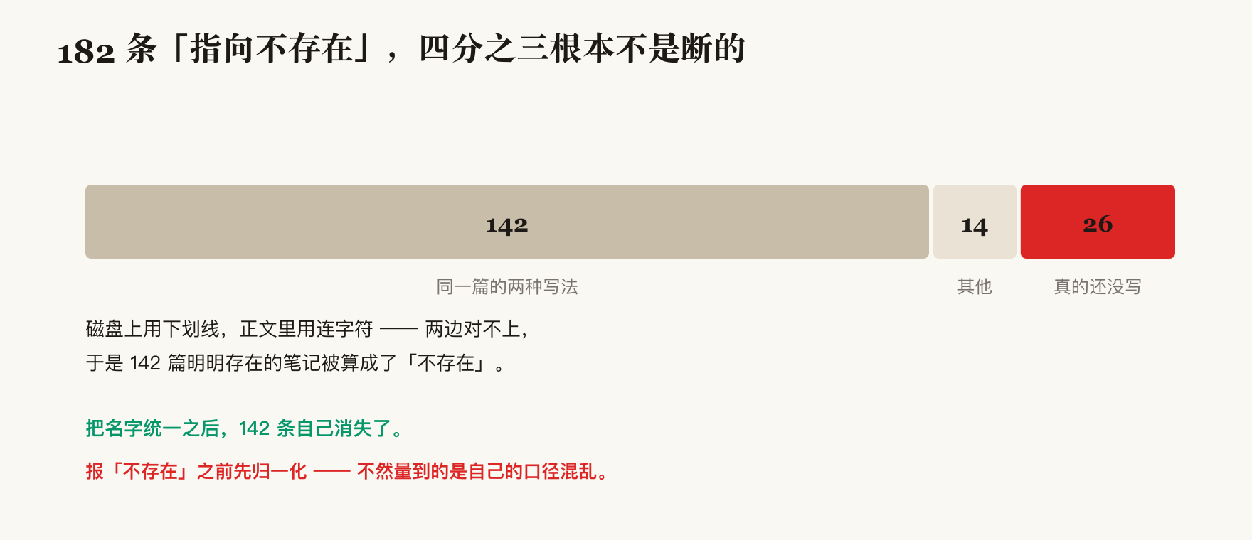
Notes reference each other by name. Back then I saw 182 links pointing at targets that didn't exist, and my first reaction was "I owe 182 unwritten notes." Checking properly, 142 of those targets did exist — the files on disk used underscores while the references in the text used hyphens, so the two sides never matched. Once I unified the naming, 142 of them vanished on their own. What remained was the genuinely unwritten set.
The lesson: normalize before you report something missing. A difference computed before normalization measures my own inconsistency, not a discovery.
Second: 419 of my 677 notes had the wrong type.
Each note starts with a type marker, used to color it on the graph. One note happened to write a slightly different field name, my pattern read its tail as well, and four hundred-odd notes ended up labeled with a type that doesn't exist.
The nasty part is that every count was self-consistent: the totals added up, everything agreed, the program raised nothing. I found it by taking a screenshot and seeing a large gray patch on the graph.
This is why self-consistent isn't correct. A number computed down one path, verified against itself, is green forever. You have to compute it again down a genuinely separate path and compare.
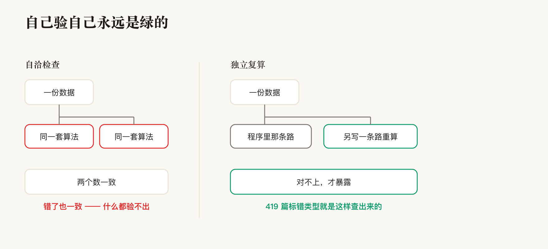
The same independent recomputation caught two more that round: cross-group links being counted before deduplication (two numbers off by 2, while the sets matched exactly — only the count was wrong); and square brackets inside a shell script being read as note references, conjuring 81 fake broken links out of nothing.
So the program now ships a self-check that runs at build time and refuses to install if it fails. It verifies five things: that nodes on the graph are clickable, that nodes on the experience network are clickable, that narrowing to one hop actually makes the graph smaller, that colliding names still have unique identifiers, and that the counts on those six rosters in the interface match what the command line reports.
That last one has a history: the sidebar once said 698 notes while the command line said 675 — placeholders for broken links were being counted into the note layer, two sets of books. After fixing it I put the bug back to confirm the guard really goes red, which is the only reason it counts as verified.
How I use it from here
Day to day it's three commands:
open -a "TL Harness"                                    # look at the graph
cd ~/Apps/mac/tl-harness && ./build.sh                  # after code changes: build + install
~/Dev/tools/dev/lib/tools/report/harness-graph --stats  # when I don't want a window
The command-line version and the app share the same scanning code, so they can't disagree: the app says "171 true orphans" and so does the command line. One is for your eyes, one is for a pipe.
| What I want | Which one |
|---|---|
| See what this mass actually looks like | App · Graph |
| Know what changing a given command affects | App · Graph, select it and narrow to one hop |
| Page a layer, search a keyword, jump to a file | App · List |
| An orphan or broken-link list I can click through | App · Insight |
| The same list, but to save to a file or feed another script | Command line |
| Confirm a config change didn't make things worse | The command line summary — compare counts before and after |
The summary looks like this, three lines:
nodes rule 11 · hook 36 · check 12 · command 18 · skill 40
      · agent 2 · engine 77 · memory 32 · edges 306
notes 677 · links 913 · broken 27 (24 distinct targets) · name collisions 6
connectivity: true orphans 171 · out-only 210 · in-only 142 · unreferenced 495
A few boundaries worth knowing before you trust it:
"Zero degree" doesn't mean "unused." Two known blind spots in how I count: a script that ships inside a skill isn't part of the "script layer" by definition, so a skill calling its own file still reads as zero degree; and the script layer only covers one directory, so calls pointing elsewhere are invisible. Keep both in mind when reading the orphan ranking.
If it can't scan, it errors — it does not draw a reassuringly clean empty graph. If any layer's scan directory is missing, the app hangs a red banner and the command line exits nonzero. But "directory present, zero items inside" is a legal state — one of my layers is fully retired and looks exactly like that. Conflating the two would make every routine cleanup blow up the whole graph.
Every number in this post will drift. As I write this the note count is 677; two hours ago it was 675, because I wrote two new ones in between. So the right way to use the comparison is before versus after a change, not checking today's numbers against the ones printed here. If they don't match, first ask whether you just added or removed something yourself.
One last point, and the one I think matters most: this graph can make the numbers look better, but it can't hold them there.
Broken links went from 182 to 26 and orphans from 183 to 149 because I used the graph to go clean up my disk — not because of any code change. With nothing standing guard, it creeps back a little each day and looks the same again in six months. So the real gate isn't in this program; it's at the moment a note gets written: check the filename convention, check the reference resolves, check it hangs off at least one link, each with a fix command attached.
Drawing makes it visible; the gate keeps it from growing back. With only the former, you get an ever-uglier picture and a version of yourself who'd rather not open it.